My front cover of my preliminary task was taken outside behind a wall and greenery however before this image I was going to use a image where my model is in front of a green screen much like my final music magazine. However, I decided not to use the image with the green screen as it was taking a long time to edit but also I didn't use a green mat so meant I had to crop my models legs which didn't look good. Although that made me learn for next time I used the green screen in my front cover of my final product; I decided to only feature the top half of their bodies so that I wouldn't have a problem editing out the green-screen around their legs. In my preliminary task I placed my model further away from the camera so that the image featured alot of the background I think this looks good however less professional so when taking my front cover images I made sure my models were the focal point on the page.Finally while making my preliminary task I hadn't done alot of research into magazines however afterwards I looked further into the production and conventions of magazines which allowed me while producing my final front cover I knew what I needed to include and how it should look so that my magazine looked professional for example the master-head being behind the models heads as I had seen this being done in well known magazines like Nylon.
Overall my front cover in my final product is very different to my preliminary task as I have gone for a more minimalistic and professional style as I preferred this to the cluttered style in my preliminary front cover as I used more cover-lines which in my opinion I don't like on the front of a magazine.


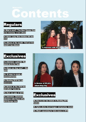
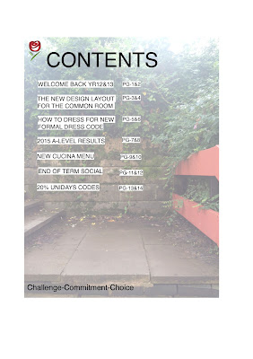
As you can see there is alot of develop from my preliminary contents page compared to my final contents page. While making my contents page for my preliminary task I found it difficult with the layout as I hadn't done alot of research into how contents pages are laid out in magazines. Even though the contents is very basic I still created a house-style by using the background I used in my front cover. When making my final product I kept in my a house style however this time keeping to the same colour scheme throughout as most conventional magazines use a house style throughout an issue. However, one thing I did take from my preliminary contents page is highlighting the text as it made it stand out however in my final contents page I used black to highlight over the white text as it made it stand out more against the light blue background.
From this process I have learnt how to produce a professional looking magazine. By starting with a preliminary task it allowed me to learn about different technologies and styles which I then was able to take forward to my final product also it allowed me to learn from my mistakes for example not using a green mat on the floor while using a green screen and using the right layout that looks the most professional. In addition my camera skills and editing skills have progressed through this process because before the preliminary task I didn't know how to work a Canon camera. Finally, I learnt how much detail goes into making a magazine that is appealing for your target audience.
Overall my front cover in my final product is very different to my preliminary task as I have gone for a more minimalistic and professional style as I preferred this to the cluttered style in my preliminary front cover as I used more cover-lines which in my opinion I don't like on the front of a magazine.


As you can see there is alot of develop from my preliminary contents page compared to my final contents page. While making my contents page for my preliminary task I found it difficult with the layout as I hadn't done alot of research into how contents pages are laid out in magazines. Even though the contents is very basic I still created a house-style by using the background I used in my front cover. When making my final product I kept in my a house style however this time keeping to the same colour scheme throughout as most conventional magazines use a house style throughout an issue. However, one thing I did take from my preliminary contents page is highlighting the text as it made it stand out however in my final contents page I used black to highlight over the white text as it made it stand out more against the light blue background.
From this process I have learnt how to produce a professional looking magazine. By starting with a preliminary task it allowed me to learn about different technologies and styles which I then was able to take forward to my final product also it allowed me to learn from my mistakes for example not using a green mat on the floor while using a green screen and using the right layout that looks the most professional. In addition my camera skills and editing skills have progressed through this process because before the preliminary task I didn't know how to work a Canon camera. Finally, I learnt how much detail goes into making a magazine that is appealing for your target audience.


